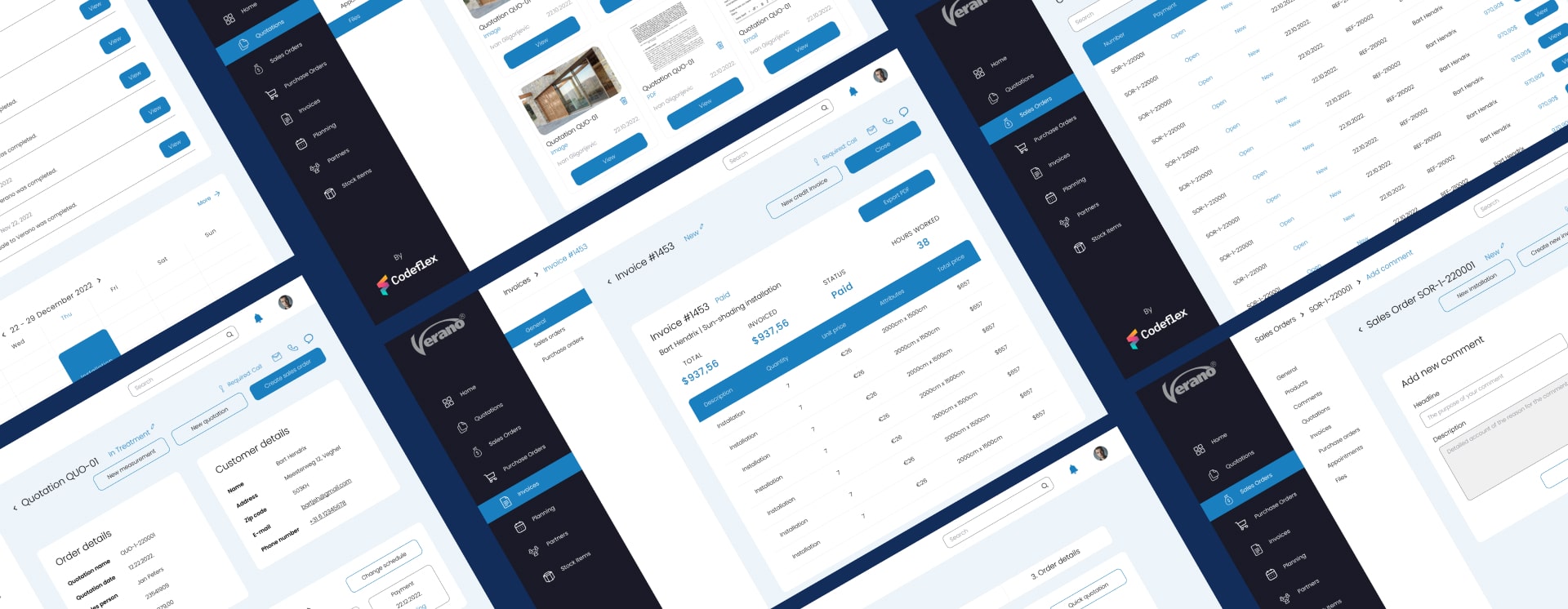
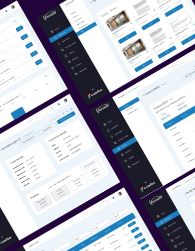
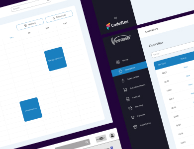
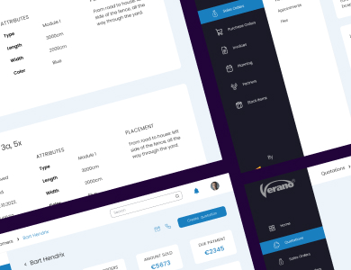
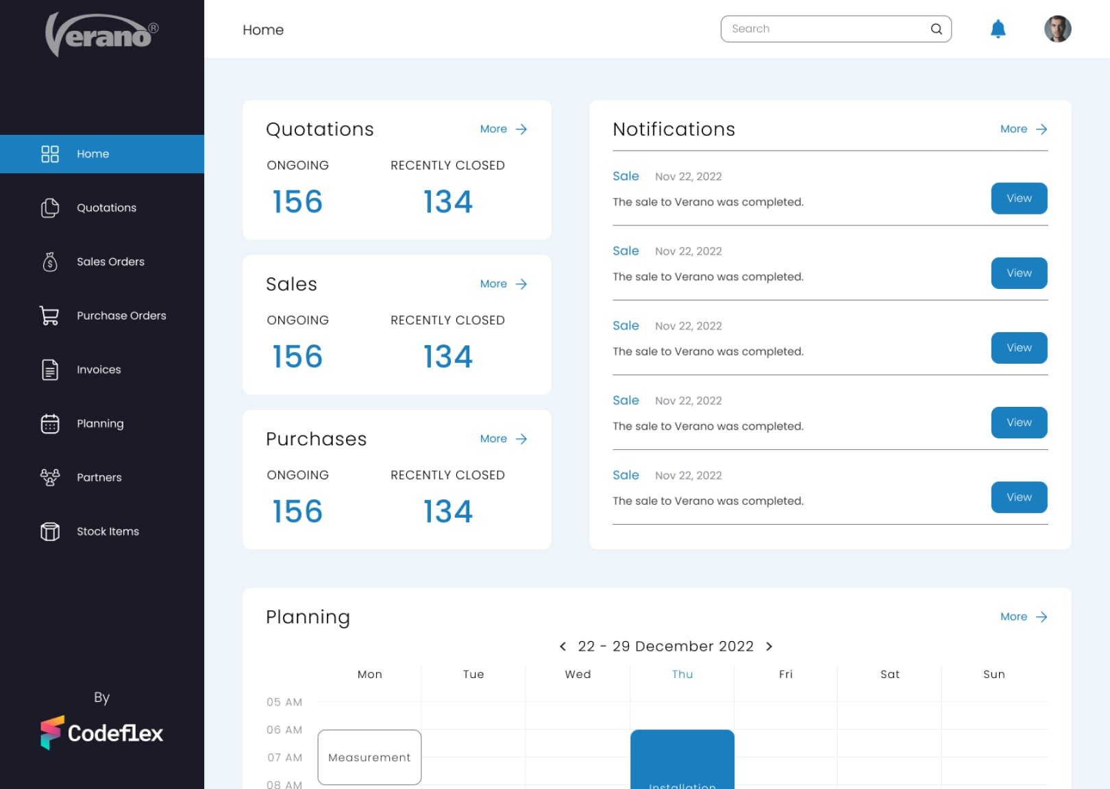
ERP systems generally have a bad reputation when it comes to usability. The problem is that they require a vast array of functionalities, so much so that they inherently become hard to use, especially for people with low tech-literacy, which coincidentally was our user profile.
By focusing on thorough research and a good UX foundation before we even built a single screen, we aimed to tackle the problem of usability and make a product that anyone can use, but that still has all the functionalities and resources it was intended to have in the first place.
Our design process started way before we actually built anything. We did research into our user base, and constructed flows and wireframes based on that research. Once that was done, we decided upon a visual identity and could get to work. We went for a modern, clean and simple look and feel that could be easily accessible to everybody.
